The Block element in website builder
A block is an element where all other same-style elements can be added. You can use it to organize content by its purpose. For example, you can place a menu in one block and add some information about your company in another.
Add a block
To add a new block, hover over the top or bottom border of the block, and click + (Add block).

In the sidebar, choose a block to add:
| Empty block | Adds a standard block with elements arranged in a grid. |
| Open block | Adds a block where you can position elements freely. |
Also, you can select ready-made blocks from the gallery organized by categories, including website header, footer, first screen, and more. Browse through categories, and select a block that fits your design.
Footer and Header are sitewide blocks that appear consistently across all pages and synchronize all changes made to them.
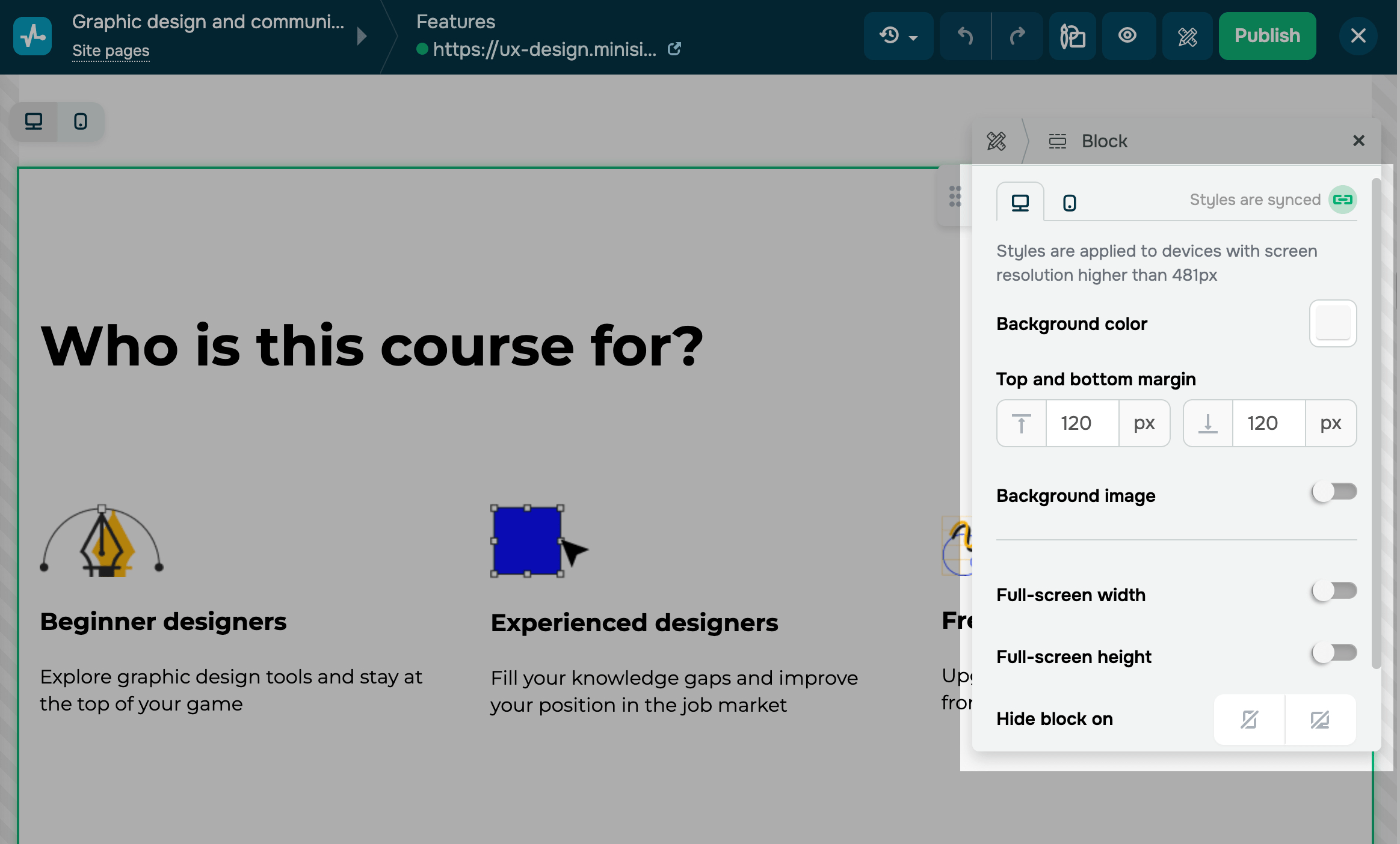
Customize your block
By default, styles are synced across all device versions. To customize each version separately, turn off Styles are synced.
You can customize the following block settings:
| Background color | Changes the block’s background color on the page. Click the icon and select a color. |
| Top and bottom margin | Adds space between a block and other elements on the page. The larger the value, the more space there will be between the block and other elements. Enter a value in pixels. |
| Background image | Sets a background image instead of a color. Turn on the toggle and select an image. |
| Contour | Adds a border around the block to highlight its edges. Turn on the toggle, set a contour thickness in pixels, and select a line type, color, and rounding. |
| Full-screen width | Stretches content to full-screen width. Turn on this toggle to make the content fit from one edge of the screen to the other. |
| Full-screen height | Stretch content to full-screen height. Turn on this toggle to make the content fill the screen height. |
| Hide block on | Hides the block on devices. |
| Pin to the top of the site | Fixes the block in your website header so that it stays on top even when you scroll |
You can also set display conditions for the block.
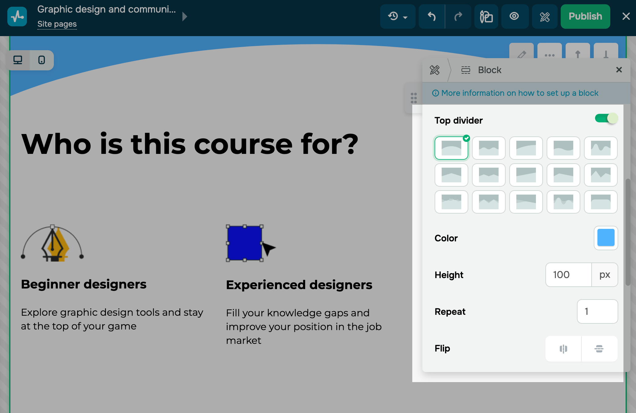
You can also space out blocks using dividers. Turn on the Top divider or Bottom divider toggle in block settings, and customize it:
| Appearance | Select a divider shape. |
| Color | Select a divider color. |
| Height | Select a divider height. |
| Repeat | Select how many times to repeat the divider shape. |
| Flip | Select how to flip the divider shape:
|
Last Updated: 18.07.2025
or